Sou Fujimoto: Field of opposites
Between Nature and Architecture is a series of lectures by Japanese architect, Sou Fujimoto, who toured Australia as a guest of Cement Concrete and Aggregates Australia. Fujimoto presented his philosophy of architecture together with a tailored collection of his projects, including the building for which he is best known, the 2013 Serpentine Galleries pavilion in London. Not only did the Serpentine commission elevate him into the rarefied air of the likes of Zumthor, Koolhaas, Nouvel and Gehry, at the age of 42 he became the youngest architect to have achieved this honour.
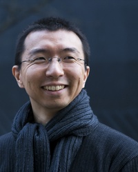
Sou Fujimoto. Image: David Vintiner
Fujimoto began his lecture by contrasting the place where he grew up – a small rural town in Hokkaido, the north island of Japan – with the place where he studied to become an architect – Tokyo. Despite the apparent differences between the two environments, Fujimoto explained that he has always felt at home in Tokyo. For him, the forest and city are compositionally similar: immense spaces made up of many smaller pieces. Natural and artificial artefacts – leaves and branches or street signs and window panes – operate in both places at the human scale.
As the title of his lecture suggests, the natural world has long been a fascination for Fujimoto. Indeed, the forest and city anecdote underpins two related themes that drive all his work and were the subject of his lecture. First is his exploration of field architecture, or the fuzzy zone that exists between fixed states. Second is his interest in the contrast and collision of opposites: natural/artificial, inside/outside, simplicity/complexity, small/large…
The projects presented ranged in scale from the very small to the very large: from a single toilet in Ichihara, Japan, to a 1.5km long shopping strip in the Middle East. These two themes wove their way through all of them, finding expression in the cloud-like edges of the Serpentine pavilion, the fragmented floor plates of NA House, and the undulating canopy of jutting balconies in the White Tree Tower.
Serpentine Galleries pavilion, 2013
Fujimoto seemed in awe of the Serpentine Galleries and their investment in the annual pavilion programme. He noted the ambition of their commissioning body, who each year seek to recreate the spirit of inventiveness of Mies van der Rohe’s Barcelona Pavilion. With some whimsy he also described the designs that were rejected, first for being too Fujimoto-like and then for being too not-Fujimoto-like. The successful design proposal managed to stay connected to, but was still a departure from, his existing canon.
It is remarkable that both he and his client could have such confidence and self-awareness to be able to appreciate and direct this process. Insightful self-reflection is not often a trait associated with architects, though perhaps the international speaking circuit has pushed Fujimoto into understanding and articulating the trajectory of his work. It is clear also that the Serpentine is no ordinary commissioning body. They seek out and attract some of the best architects in the world, demand enormous creativity and effort from them (highly experimental pavilions executed from commission to construction in just three months), and have achieved a lineage of follies that are covered by architectural and mainstream media in every corner of the globe.
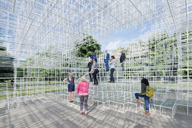
The light filigree structure of Fujimoto’s Serpentine pavilion. Image: Courtesy Sou Fujimoto Architects
Fujimoto’s winning proposal started from the idea of a continuous surface wrapping around the core cafe function of the pavilion, a simple sketch that looked a bit like a rolling wave. But both surface and program were dissolved and deconstructed into a repetitive matrix of 20mm white steel pipes, assembled across a combination of 400 x 400mm and 800 x 800mm grids. From a distance the pavilion resembles a soft white cloud, a carefully determined shape that somehow resists a determined form. Constantly shifting, from one angle it mimics the roofline and window reveals of the Serpentine Galleries behind, from another it becomes tree-like, from yet another the rolling wave reasserts itself.
Drawing the design in two dimensions was unhelpful, nothing more than fields of dots on a page. Even the three dimensions of a digital modelling environment lacked the depth and nuance the project required. So Fujimoto’s studio built a 1:10 model and the design development process saw him stalking it with a pair of scissors in hand, pruning a stick here and there as if it were a topiary hedge. A staff member would trot after him, attaching coloured tape to the modified areas so the minute changes could be fed back into the computer-based documentation.
In this project, the field is strongly evident. The pavilion’s form is somehow both finite and constantly shifting, its program is intimate yet undefined. Even furniture has an opportunity to unravel the order of the grid: standard cafe furniture create plinths for the “bottom parts of the body, their charming quality offseting the clarity of the grid.” The spacing of the grids permits further disruption: by dogs that walk through them and children who climb into them. The pavilion is a symphony of opposites: simple grids of sticks achieve great formal complexity; inside and outside are indistinguishable from each other; the traditional tectonics of buildings (walls and roofs, stairs and seats) are playfully dissolved.
NA House, 2011
In a hip, lively part of Tokyo, NA House is located on a typically small parcel of land measuring just 6 x 9m. Fujimoto felt that a large room on this site was not possible: it could only ever support a large small room. Fortunately, the clients were a young couple enthusiastic about (and presumably wealthy enough to take a risk on) an experimental house.
Fujimoto’s response was based on two radical gestures: first, the front and side facades are almost entirely transparent (even curtains appear to have been avoided); second, the floor plates are split across many levels, dissolved into small parts.
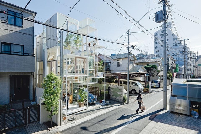
NA House by Sou Fujimoto Architects. Image: Courtesy Sou Fujimoto Architects
Fujimoto spoke mostly of the floor plates, describing them as mini platforms operating at the scale of furniture. They are separated vertically according to the heights of chairs, tables and benches – the dimensions of the human body. In some instances, ceilings are as low as 1500mm, creating nooks to be crawled into. Life is distributed fluidly across the platforms, a nebulous field that expands and contracts to fit the activity and size of gathering at hand. There is nothing as prosaic as a living room, meals area or bedroom in NA House. The platforms become whatever is needed: a bench seat now, a work surface later. This intent is revealed by photos that show bags, books and computers strewn freely across the floor. The house is full of edges, each creating temporary territories that its residents configure and reconfigure as required.
Though he didn’t discuss it, the transparency of NA House is truly bizarre, particularly in a city as dense as Tokyo. It is far more common to see Japanese architecture that carefully orchestrates views into and out of the interior volumes. The interior life is entirely on show here, as much a part of the streetscape as Tokyo’s famous Omotesando flagship retail stores. Not unlike Fujimoto’s glass toilet in Ichihara, private space is pushed right up to the edge of public space. I wonder what it would be like to live here at night, with each window a glowing billboard of one’s life? Would the house’s residents feel exposed, or would they feel protected by the anonymity of the street?
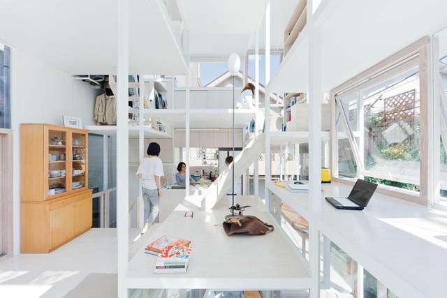
Interior of NA House by Sou Fujimoto Architects. Image: Courtesy Sou Fujimoto Architects
If anything, NA House is as clear a demonstration of the experimental quality of Sou Fujimoto’s work as the Serpentine pavilion. In a typology generally defined by conservative, risk-averse commissions, it is a radical redefinition of the programming, tectonics and urbanity of inner city living.
White Tree Tower, 2014
Fujimoto won the White Tree Tower project following the aptly named Architectural Folly of the 21st Century design competition. It is perhaps no surprise that a competition so named would be won by an architect who wraps toilets and inner city houses in glass. It is a multi-residential tower located amongst the good food, good weather and good life of the Mediterranean, with an undulating facade sprouting a dense canopy of deeply cantilevered balconies.
The interior volumes of the apartments look much like any other contemporary apartment design, but the balconies are a clever and formally evocative gesture that responds well to the local climate. Fujimoto observed that the majority of Mediterranean life is spent outdoors, is indeed the defining characteristic of the region: why should living in an apartment not provide the same opportunities? The building not only functions like it belongs in a warm climate, its tree-like form makes it look like it does too.
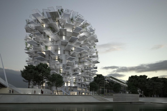
The proposed White Tree Tower for the Architectural Folly of the 21st Century design competition, 2014. Image: Courtesy Sou Fujimoto Architects
The balconies are this project’s expression of the fuzzy field. In Australia, I are used to seeing facades designed parametrically to obscure unwanted sun, with each window carefully finessed to achieve maximum thermal performance.
Fujimoto is not interested in performance-driven architecture though (the balconies wrap 360 degrees around the building, despite the fact that the north face will not receive much direct sunlight), for him, narrative and social context are more valuable. The randomly jutting balconies and roofs will provide shade in an unpredictable pattern – a true intersection of natural and artificial constructs. The tower’s residents will live at the edge of a built forest, shifting positions on their (sometimes multi-storey) balconies to catch the last rays of sun or find relief in the last square inches of shade.
Like NA House, White Tree Tower pushes the most intimate of residential spaces to the very edge of the building. Life is put on display, the building energized by the activity within it. The exciting parts of the building are at its edges, precisely where the field likes to operate. Fujimoto has juxtaposed the public and the private, big and small, inside and outside, climate and climate-control.
What did I think?
I recall studying the theory of field architecture during our Bachelor of Architecture degrees, but until hearing Fujimoto speak, have never encountered a practicing architect who proactively explores it in his or her work. It’s not just rhetoric either: Fujimoto’s buildings are genuinely strong expressions of the undefined area between opposites. Edges of roofs are slowly dispersed to blur the boundary between inside and out; deterministic room types are dissolved in favour of platforms that support shifting regions of activities; balconies provide shade without symmetry.
This is an impressive trajectory that reinforces the clarity in Fujimoto’s self awareness: each project teases out the issues further, finds new formal expression for old ideas. He is also a great distiller. A project is reduced to its core idea, which is then expanded to cover all facets of a design.
Across all scales, Fujimoto is deeply experimental. Even the 1.5km long Souk Mirage masterplanning project explores the juxtaposition of natural and artificial orders, and the possibilities of undefined, field behaviours that can be found in the zone between. This is an impressive trajectory that reinforces the clarity in Fujimoto’s self awareness: each project teases out the issues further, finds new formal expression for old ideas. He is also a great distiller. A project is reduced to its core idea, which is then expanded to cover all facets of a design. This is of course true of his formal gestures, for instance, a grid of sticks to makes walls, roofs, stairs and furniture. It is also true of his ideas, he “thinks about nature simply,” proceeding step by step to deepen the relationship between the architectural and natural environments.
Our lasting impression of Sou Fujimoto is a man of embedded contradictions. Like his work, he is the result of the contrast and collisions of opposites. He is confident in himself and his work, but he is also modest. He is playing on a world stage against architects pushing into their 70s, but he is still young. He makes serious architectural enquiries but retains a sense of lightness and humour.
It is easy to overlook his predominantly pristine, white work in a country of highly creative architects producing pristine, white work. But to our pleasure, I discovered that his architecture becomes much more interesting below the surface. It is inventive, rich and complex. Even the whiteness contains a story. When asked whether he’s ever thought about using colour, Fujimoto responded by saying, “I hate white. But, it is a very powerful colour, it grabbed me and doesn’t like to let me go.”
And why should it indeed?
This review was reproduced with permission from Panfilocastaldi. Sou Fujimoto was the guest of C+A Talks in July 2014.
ArchitectureAU – Reviews
Bài Liên Quan:
Không có bài liên quan.
