Swinburne House
“No house should ever be on a hill or on anything. It should be of the hill. Belonging to it. Hill and house should live together each the happier for the other,” noted Frank Lloyd Wright in An Autobiography (1932). Lloyd Wright was known to set up camp and live on site to better understand a location. Luckily for Craig Rossetti, of Craig Rossetti Architects, five years of long lunches with his client, and perhaps a hit of tennis at the public courts next door, provided ample opportunity to appreciate the site for a new house in Hawthorn, Melbourne.
Swinburne House, the second house that Craig has completed for the family, is most definitely “of” its site. The long wedge of land’s street frontage forms an arc that follows the line of a curved, tree-lined avenue. In many ways, this curve sets the dynamic of the entire project. A long pool fence in glass-reinforced concrete projects tangentially to the curve of the street, setting its course right through the house, animating the central corridor and creating an embracing gesture to the kitchen and living areas to the north as it does so.

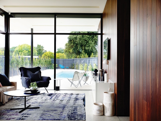
Floor-to-ceiling glazing provides a grand sense of space to the downstairs living room. Image: Derek Swalwell
The curve, however, is only one element of this complex composition. Craig notes that the house “had to pull together multiple aspects” – the tennis courts and commercial entities
to the north, an archetypal pair of 1950–60s modernist homes to the south, and the mix of Victorian and Queen Anne style homes typically found in the area. Craig has orchestrated a home of multiple personalities, focusing on a “separation of the elements” in an attempt to knit together these disparate aspects. A new garage on the southern boundary seamlessly continues the adjacent garage in both height and colour, creating a single mass that blurs the boundary between the new and existing homes. Hovering somewhat ostentatiously over this is a fly roof, folded and shaped to create a bridging device between the garage and the dominant “personality,” the white rendered box. Hoisted over a weightless glass pavilion on the ground floor, and taking full advantage of gardens to three sides, the box is perhaps better described as a shell, creating a nook into which the first-floor program has been slotted. To the north and east the house opens to a generous wraparound deck, taking on the “personality” of a rather grand pavilion from which to watch the tennis.

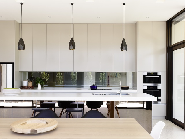
The kitchen boasts an elegantly simple, robust material palette. Image: Derek Swalwell
With a brief from the client to create an interior that enjoys hotel sophistication while meeting the practical demands of a young family, interior designer Mardi Doherty of Doherty Design Studio has created an interior that nimbly adapts to the separated elements of the house, tying the spaces together with a palette of cool timbers, bold highlight colours and a suite of curious geometric motifs that turn up in surprising places. On the ground floor, sharply detailed joinery and honest finishes are entirely harmonious with the robust and raw edge of the cladding materials of concrete, spotted gum and glass-reinforced concrete panels, extended from the exterior into the kitchen and family rooms. The panels, manufactured commercially by the client, line the curving heart of the home. An etched pattern, based on an abstracted image of an old wall after creeping ivy had been removed, creates a surface that appears somewhere between polished plaster and deeply veined marble – the finish has a subtlety and life that is entirely unique.

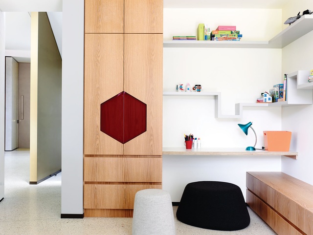
Sharply detailed joinery sits harmoniously with the robust polished concrete floor on the ground level. Image: Derek Swalwell
Also on the ground floor, the children’s play area is full of playful details, stepping shelves invite artful arrangements and natural timber cupboards are opened with a large red hexagonal pull, but just like the selectively used highlights of blue and yellow in the children’s bedrooms on the first floor, there is a restraint preventing these areas from becoming condescending exercises in kitsch. As requested by the client, entering the parents’ area is like stepping into another world; a freestanding bath is set off by a stunning wall of three-dimensional tiles, exuding a hotel atmosphere that, as the owner noted, gives them the feeling of being on a weekend away.
Architects can be anxious about taking on a builder as a client, but this was never an issue with this project. From the custom hexagonal handbasin in the pool change room, which
was discussed one weekend and fabricated by the client long before building the house had even started, to the custom glazing element by a Melbourne glass artist, held aloft over the entry, it is the truly collaborative approach that has resulted in the success of this project.
ArchitectureAU – Projects
Bài Liên Quan:
Không có bài liên quan.
